Flow 3
Layers
Layers are now available in Flow. It’s been one of our most requested features and we’ve spent months working with our testers to get it just right.
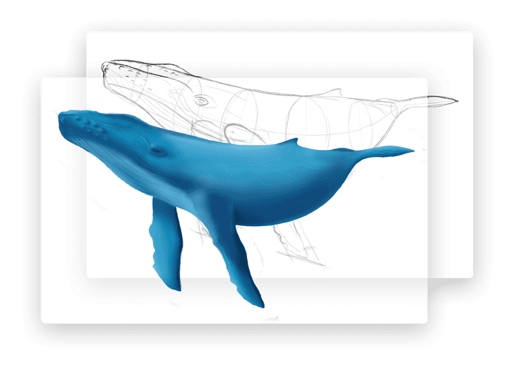
Layers are like stacked pieces of transparent paper. You can draw on them independently, you can merge them, rearrange their order, hide or show them and change their opacity. Layers create a safeguard for your work so you can change individual parts while preserving the rest. For example, you might sketch something with pencil on one layer, then draw over the top with ink then hide the original pencil sketch layer completely. You can also bring that layer back if you want to start again.
Layers Panel
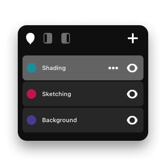
Tap the Layers button to get started. You can dock the layers panel on either side of the screen or drag it around to somewhere handy for you. If you open Flow on your iPhone in Pencil Case mode, your layers can be controlled from your iPhone, leaving your iPad uncluttered. If you use an Apple Pencil 2, the double-tap gesture can be configured to toggle the layers panel.
Working with Layers
- By default every document has a background layer which cannot be removed.
- Tap on a layer to make it active. Any new strokes will be added to this layer.
- Tap the visibility (eye) button to hide or show a layer.
- Long press the visibility (eye) button to temporarily show a layer in isolation.
- Drag layers to rearrange their order.
- Tap the + button to add a new layer.
Layer Options
- Tap the … button to show the layer options menu.
- Choose a color for the layer. This is helpful for color-coding different types of layers. For example, you might choose blue for draft content and green for final content.
- Adjust the slider to change layer opacity.
- Rename allows you change the title of a layer.
- Merge Down combines the current layer with the layer directly underneath and inherits the opacity of the target layer.
- Clear removes all content from the selected layer.
- Duplicate allows you to directly replicate a layer.
- Delete removes the layer entirely.
Selecting and Erasing with Layers
- When you select the eraser or lasso knife tool, you can toggle between affecting content from the currently selected layer or all enabled layers.
- Enabled layers are toggled by the tick button next to each layer name, this only appears when using the eraser or lasso knife.
Other Tips
- If you copy content from one document into another, the layers will also be copied along with their respective opacity settings.
Flow Web Viewer
You can now view your Flow documents in your web browser! Just login with your account at flowapp.moleskinestudio.com to check it out.
You can download documents in high resolution, making it quick and easy to use content on your desktop.
Note - existing documents will need to be opened on your iPad or iPhone in the latest version of the app before they will open on the web. This just needs to happen once - new documents will be available straight away.
Drawing – pressure curves, hover, pen sizes and more
Pressure Curves
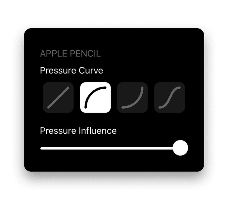
You can now choose from four different Apple Pencil pressure curves, along with the corresponding influence that the curve has on your drawing. You can easily access this by the Gesture Settings button along the top right.
Hover
If you have the latest iPad Pro with Apple Pencil, you can now see a preview of your strokes when hovering.
Pen Sizes
We’ve added WAY more pen sizes. Bigger. Smaller. We’ve got it all.
Panning
You can now pan the canvas further off screen when zoomed, making it easier to position your work where you want it.
Performance
There are some big performance boosts in this release, reducing latency and load times even more.
Marker Tool Blending
The chisel marker and round marker tools now apply their ink additively to the page, so when you draw with multiple passes the colour remains the same but increases in strength, whereas previously these tools would darken the page as you drew over a spot multiple times.
Select, Rotate and Scale
We’ve overhauled how you can select and transform to make it quicker and more intuitive.
Selecting
- When using the Lasso, you can now just tap to select objects rather than having to draw around them.
- You can toggle whether your selection comes from the current layer or all enabled layers.
- With an active selection, you can choose a different layer and tap ‘Move to current layer’ to reorganise your document.
- If you want to select everything, tap and hold on the Lasso Knife in the tool dock.
Rotating and scaling
- Objects now have handles which allows you to scale from corners or from the centre.
- The new rotate handle allows more accurate spinning goodness by showing the degrees of rotation.
- You can turn on ‘Snap’ by tapping the magnet icon to lock moving along an axis (shown by yellow guide lines). Rotation will be locked to 5º increments.
Images
- It’s now easier to use images in your documents.
- Just tap an image with the Lasso to see the new images editor with options for editing opacity, resetting rotation or replacing the image with another.
Pencil Case
If you haven’t already tried Pencil Case - it moves your tools to your iPhone screen so you can have an immersive experience on iPad.
We’ve streamlined the Pencil Case layout to be clearer and we’ve added Layers so you can dedicate your iPhone to controlling them, giving you more real estate on iPad.
Give it a try by opening Flow on both devices side by side and watch the magic happen.
Timelapse
Our timelapse feature is unique because you can open any of your documents and retroactively create an awesome timelapse video from it. We’ve added a great new setting where you can choose whether it’s created based on time strokes were drawn, or based on the layered order of them (bottom to top). We’ve also tweaked the GIF export to repeat the last frame so it highlights the end result. We love sharing Timelapse GIFs on Instagram so be sure to tag us @moleskinestudio when you post there.
Interface
We’ve made countless improvements to the interface, including:
- Dark mode! Tap the new button to switch between dark and light interface modes.
- The pen editor compact layout is now thinner and docks to the side of the screen. You can still spin the colour selector vertically to make quick hue changes.
- The full pen editor has a clearer interface for changing colour saturation by dragging left and right.
- The tool dock has been rearranged with updated pen styling to see colors clearer.
- When hiding the UI, the button to show the UI is now easier to tap.
- The iPad multitasking menu button has been updated so it’s easier to tap.
- Page settings are clearer.
Thanks
If you want to chat to our developers and designers directly about these features (or something else), just email flow@moleskinestudio.com. We love hearing from you.


